Tablets and foldables
The EnaFeedback mobile app adapts to tablets, landscape phones and foldables with window size classes, a side rail, two-column list-detail and hinge support.
- Mobile app
This article was verified with an older release. Screen names or steps may differ in the current version.
From version 1.10.0, the EnaFeedback mobile app makes better use of the screen on tablets, phones held in landscape and foldable phones. The layout follows the app's window, not the device type, so splitting the screen on iPad, Android multi-window, or folding and unfolding a foldable phone changes the layout immediately. The portrait phone layout is unchanged. This article applies to visitor, staff and admin modes.
Required role / permission and version
- No role or permission needed.
- EnaFeedback Mobile 1.10.0 or later. There is no new server requirement (EnaFeedback 2.2.0 or later is enough).
Window size classes
Layout by window width
Compact
Under 600 dp · bottom bar
Medium
600–839 dp · centered bottom bar
Expanded
840 dp and up · side rail and two columns
The app sorts the window width into three classes and checks the height separately:
| Class | Width | Layout |
|---|---|---|
| Compact | Below 600 dp | Phone layout: full-width tab bar at the bottom |
| Medium | 600–839 dp | The bottom bar narrows to 560 dp and centers; sheets open as centered panels |
| Expanded | 840 dp and above | A side rail on the left instead of the bottom bar; two columns in Message center and inboxes |
| Short | Height below 480 dp | Landscape phone or split screen: the side rail is used when the width is at least 600 dp, and headers get smaller |
Side rail and bottom bar
- In expanded windows (for example iPad in landscape, or a wide split-screen window) the tabs sit in a vertical rail on the left. The Location button (the NFC settings button in admin mode) is at the top of the rail. The rail replaces the bottom bar; you never see both.
- Landscape phones also use the rail. In landscape the bottom bar took up a quarter of the height.
- In medium windows (for example a tablet in portrait) the bottom bar stays, narrowed and centered.
- The open page is kept when the layout changes: rotating the phone or resizing the window keeps you on the same page.
The tabs are the same in every layout. For the tabs per role, see Mobile app overview.
Two-column list and detail
In expanded windows these screens open in two columns: the list on the left and the selected item on the right.
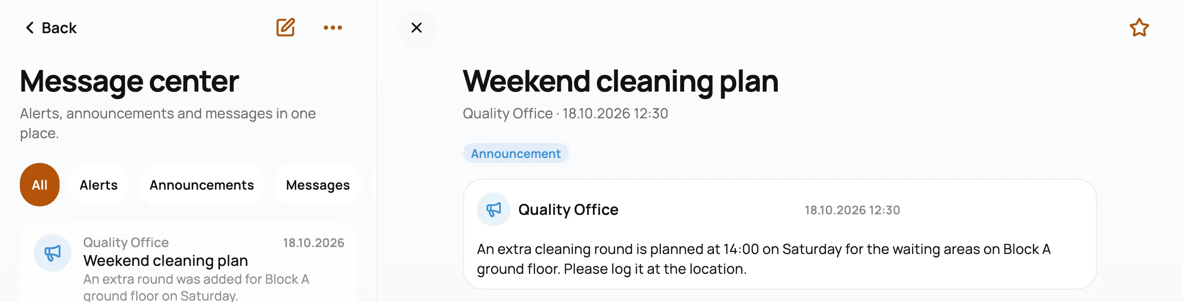
On a wide window the message center opens in two columns (test data)
- Message center (all modes)
- The admin Inbox
- The Teams inbox
While nothing is selected, the right pane says "Select an item from the list to see its details." In compact and medium windows the list appears alone and an item opens as a separate page. The list keeps its scroll position and filters.
Foldable phones
- On book-style foldables, when the window is in the expanded class and a hinge splits it vertically, two-column screens split at the hinge, with the list and the detail on either side.
- The open item survives folding and unfolding: when you fold the device, the item stays open as a separate page; when you unfold it, it moves back into the right pane.
Other tablet adjustments
- Content width is capped: forms and reading pages at 640 dp, the visitor and staff home at 720 dp, admin dashboards and reports at 960 dp, centered.
- Sheets open as centered panels from 600 dp; their height is calculated from phone proportions. Confirmation dialogs are at most 560 dp wide.
- Full-screen forms (feedback, cleaning report, survey) are centered on tablets.
- The QR, NFC ready and NFC batch setup screens, the form send button and the check-out time picker fit landscape screens. KPI and chart grids change their column count with the width.
- On the organization code screen, the card is vertically centered; with the keyboard open, Continue stays visible.
Devices without NFC
On devices without NFC hardware (for example iPad), NFC entries are hidden. The organization screen, location header, Report and Actions only mention QR codes. Scan locations by QR code on these devices. On devices that have NFC but have it turned off, the options stay visible.
Known limits
- In expanded windows, two columns exist only in Message center, the admin inbox and the team inbox; reports and forms stay in a single centered column.
- On devices with a horizontal hinge (laptop-style folding), the window does not split at the hinge.
Related articles
Can't find what you need?
Our support team can help with anything from setup to reporting.
Admin mode
Admins use the EnaFeedback mobile app for summary KPIs, the inbox and record actions, reports, On site now, the timesheet summary, messages and NFC settings.
Mobile app security and privacy
How the EnaFeedback mobile app protects data: app lock, secure session storage, data cleared on reinstall, crash reports, media privacy and permissions.